
London Original Print Fair April 2019
I was eagerly looking forward to this exhibition as for several months now I have been experimenting with printmaking. Here was a chance to see original prints by the Masters like Lucian Freud, David Hockney, Christopher Nevinson, Grason Perry, Marc Chagall, Francis Bacon, Pablo Picasso and Salvador Dali and others.
The building itself in Piccadilly is stunningly beautiful and entry is free but you have to pay for exhibitions like the London Print Fair.
Out of the hundreds of pieces these were my favourites:
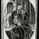
drypoint with hand-colouring on wove paper.
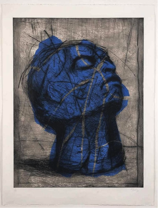
Kentridge made this during a time in South Africa when the country was just beginning democracy after a very troubled period. The head is looking upwards moving forwards but shows its past with many scars of violence.
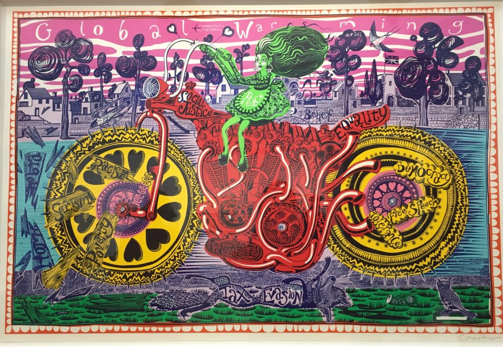
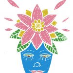
Woodcut.
I love the colours in this print and the image of Perry’s alter ego Claire! He likes to make fun of politics and in this print he’s riding a motorbike with trendy slogans around him.
Carborundum printmaking
It was fascinating to see pieces created by this type of printmaking. I have not come across this method before.
There are three different types of Carborundum grit – rough, medium and fine, this creates a fine surface to work and print from. Carborundum grit is mixed with glue to make printmaking plates. You can get detailed pieces if you work in the medium. The contrasts between the blacks and whites are very good.

Royal Academy of Arts.
This beautiful piece was made after the artist made a sea voyage through Artic waters. The use of silvery ink sparkles against the darker blues and purples of the night sky.
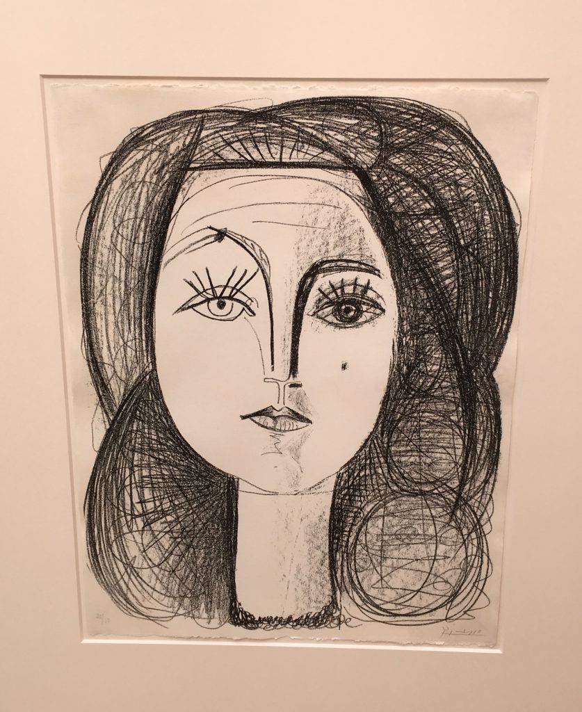
Francoise Gilot inspired Picasso to create prints of her. Apparently he was taught how to print make by a master but then did everything his way! He would not retouch either.
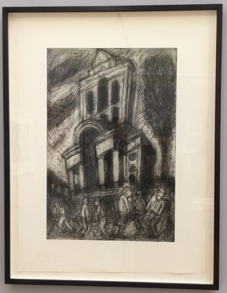
Etching and aquatint.
Aquatint is a type of etching that only produces areas of tone rather than lines and is used in conjunction with etching to give outlines. This artist’s prints shows the streets of inner London and some of his family and friends.

Coloured by lithograph after the gouache.
I always love Dali’s dreamlike and colourful images.
Talks Programme
I also attended three talks given by professionals in the printmaking world.
Creativity and Collaboration – the Role of the Print Publisher:
Helen Waters, a Director of the Alan Cristea Gallery in London (one of the world’s largest publishers of original contemporary prints and editions) explained her role in persuading well known artists to collaborate with master print makers to produce printmaking works. Most of these artists had never used printmaking beforeand she told stories of how the collaborations came to be and showed examples of the results. It was interesting to see this side of art production as I have always just focussed on the artists themselves.
Two Helsinki based artists – EGS and Jaakko Mattila
“Impossibility of an Island”
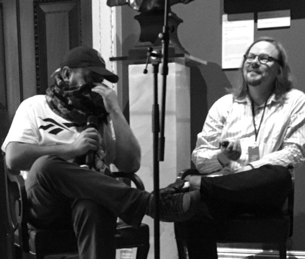
EGS
This artist likes to be called EGS which are his initials not his name. He also has a mysterious persona like his art as during his talk he covered most of his face. After graduating with a BA Hons in Graphic Design, he travelled the world doing his graffiti art – works that always included his initials in some form.
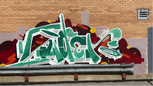
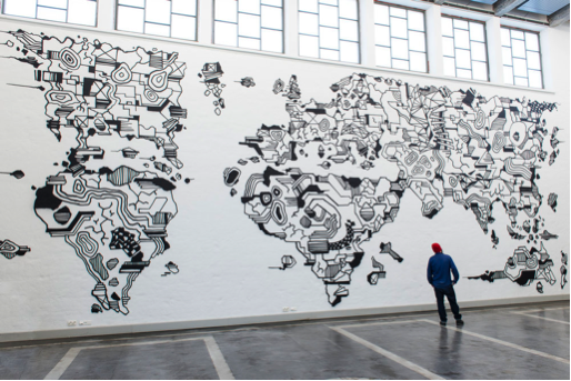
He then went on to do world maps in pen and black Indian ink via a syringe but still in a graffiti style.
Jaakko Mattila
This artist graduated in art and design and was interested in creating a sense of illusion being inspired by nature. He creates circles of watercolour and ink which bleed. He calculates in which direction this happens. He has spent a long time learning about pigments and colour structures and only uses pure colours.
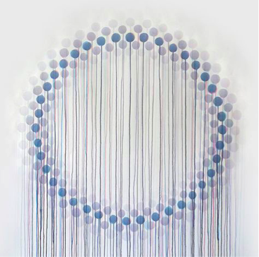
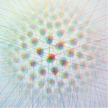
I find Jaakko’s work very inspiring as he came across his style accidentally by watching a single circle of paint bleed. This inspired him to create these beautiful intricate pieces. I also was intrigued with how ink can bleed into different directions and when dry turns into something different.
The experience for me at the London Original Print Fair was fantastic and I learned it is important to produce art in whatever shape or form because one day inspiration will lead you on to do some good work.